Revenue Forecasting

I worked at SAP AppHaus as a design intern in the second half of 2015. AppHaus is a design service team that aims to bring the best experience to business applications. I participated in a couple of client projects, and one of them was to simplify revenue forecasting.

Project Logo

Understanding the problem

Revenue forecasting is a very manual and error-prone process

Imagine you are an aspiring project manager at a large IT company. You came to this job because you love collaborating with people and leading project management efforts. However, you found yourself spending most of the time dealing with numbers — financial forecast 📊.

Every Monday, you email the 20 people who work on the projects you’re leading for their hours. You pull that data into a spreadsheet, multiply those with each individual’s rates, update into an internal system, compare the sum with predictions, note the differences, before finally sending the report out to your manager for discussion.

Yes, these are all small things, but small things can add up. You wish you could spend more time on project management, building customer relationships, and delivering the best project results.

Teams use a wide range of tools and formats across the globe

Without a well-defined way of data gathering and reporting, teams across the globe develop their own ways of collecting and reporting the forecast. This is best manifested by the vast variety of tools where data are stored. There are even teams dedicated solely to integrate the different formats at each level for reporting.
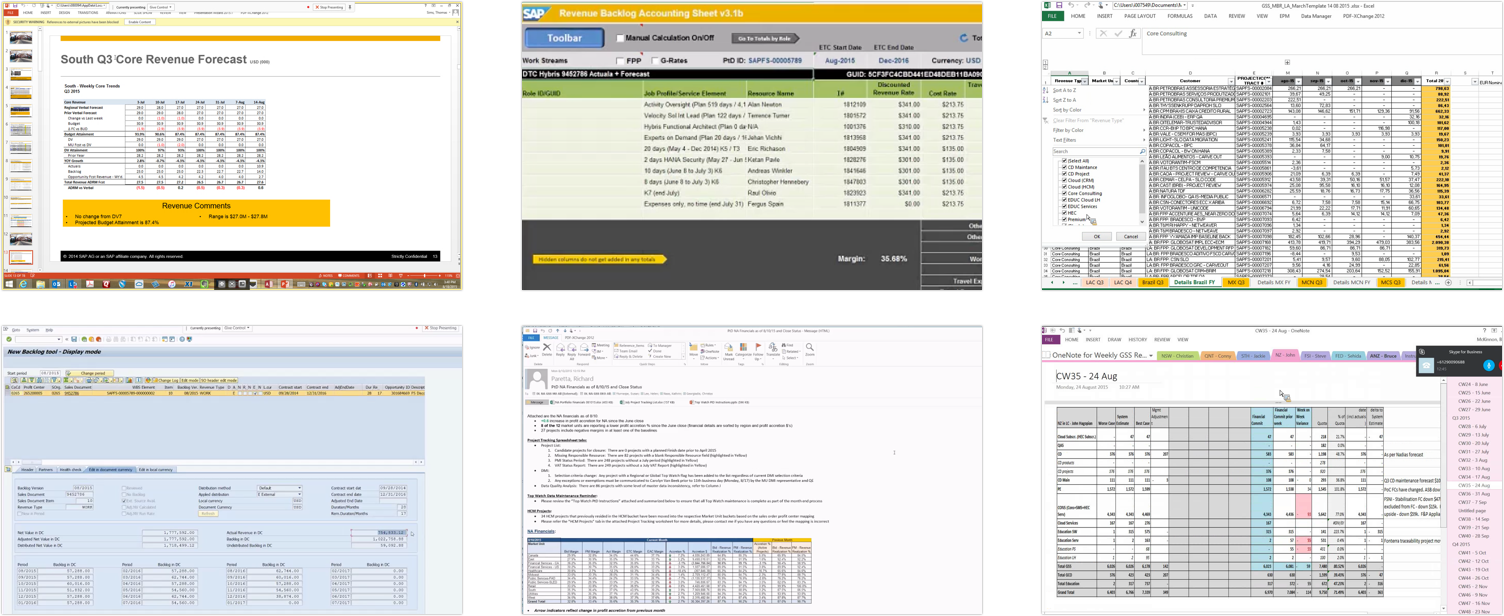
screenshot of reports
Reports stored in Excel, Onenote, Email, Slides, Internal systems

Leadership lacks trust in the accuracy of the data

Leadership is fully aware that revenue forecasting is very manual and error-prone, and that brings down their confidence for the accuracy of the reports. Also, all the data they see and problems they hear are secondhand. It is almost impossible for them to trouble shoot the data discrepancies. For data savvy leaders, the barrier to doing a data deep dive also diminishes their trust in the reports.

Design Goals

Our team is commissioned to simplifying the process. Based on the findings from 21 interviews with staff across the organization, we defined the design goals as follows:

  • Maintain one single source of truth as opposed to using multiple tools
  • Reduce the effort in data collection, and let the computers do the computation
  • Empower project managers and leadership to be more proactive in identifying patterns.

Solution
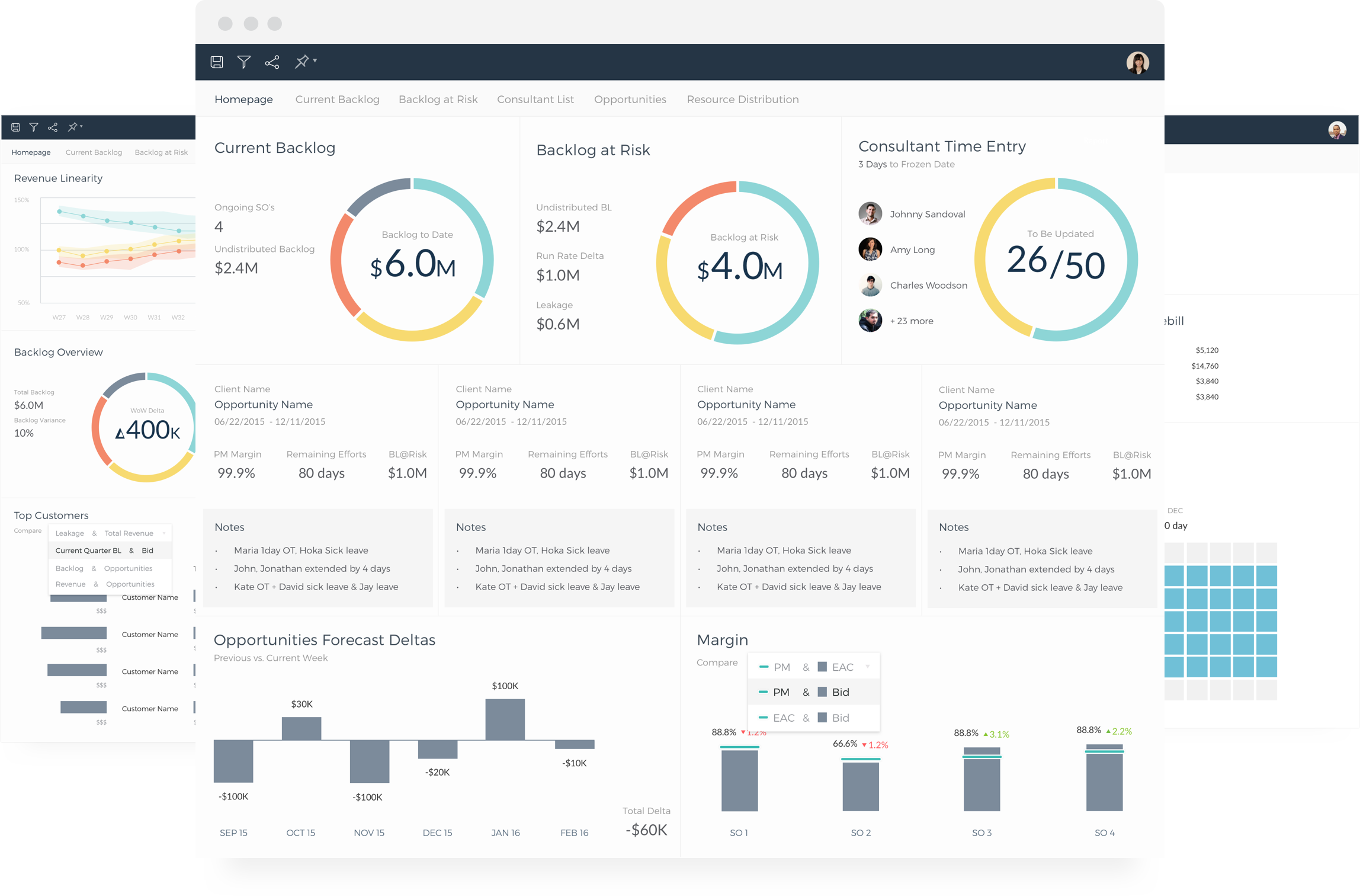
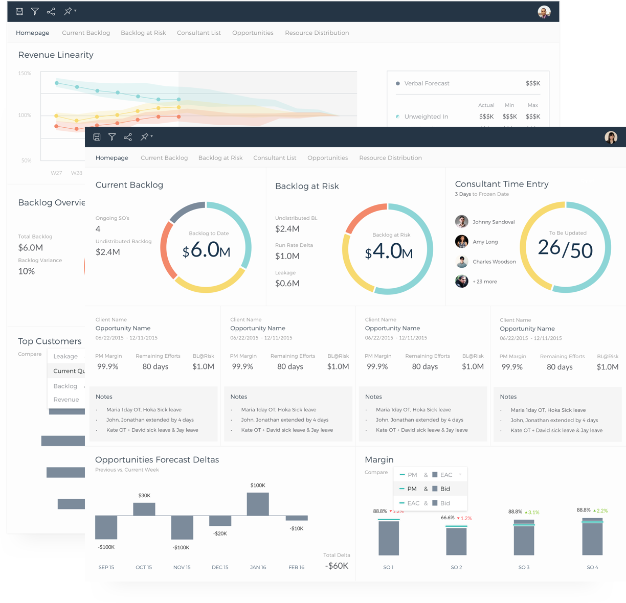
One system, two views

  • Two dashboards, one for the project managers, and the other for leadership
  • See the most relevant KPIs, while sharing the same source of data
  • Promote transparency while maintaining one single source of truth.

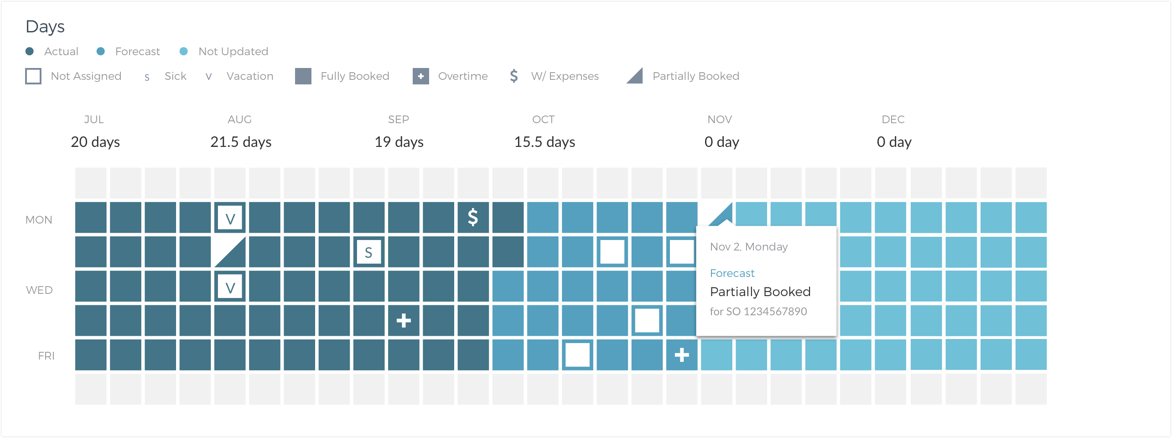
Drilling down to the finest details

Both project managers and the leadership team share the same view of the finest details so that they are always on the same page during meetings.

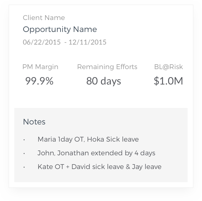
Quick overview cards

Every major KPI is listed as a card in the dashboard so that users may get an idea with the bigger picture from a quick glance. Adopting a card-based UI also helps with the scalability of the system.

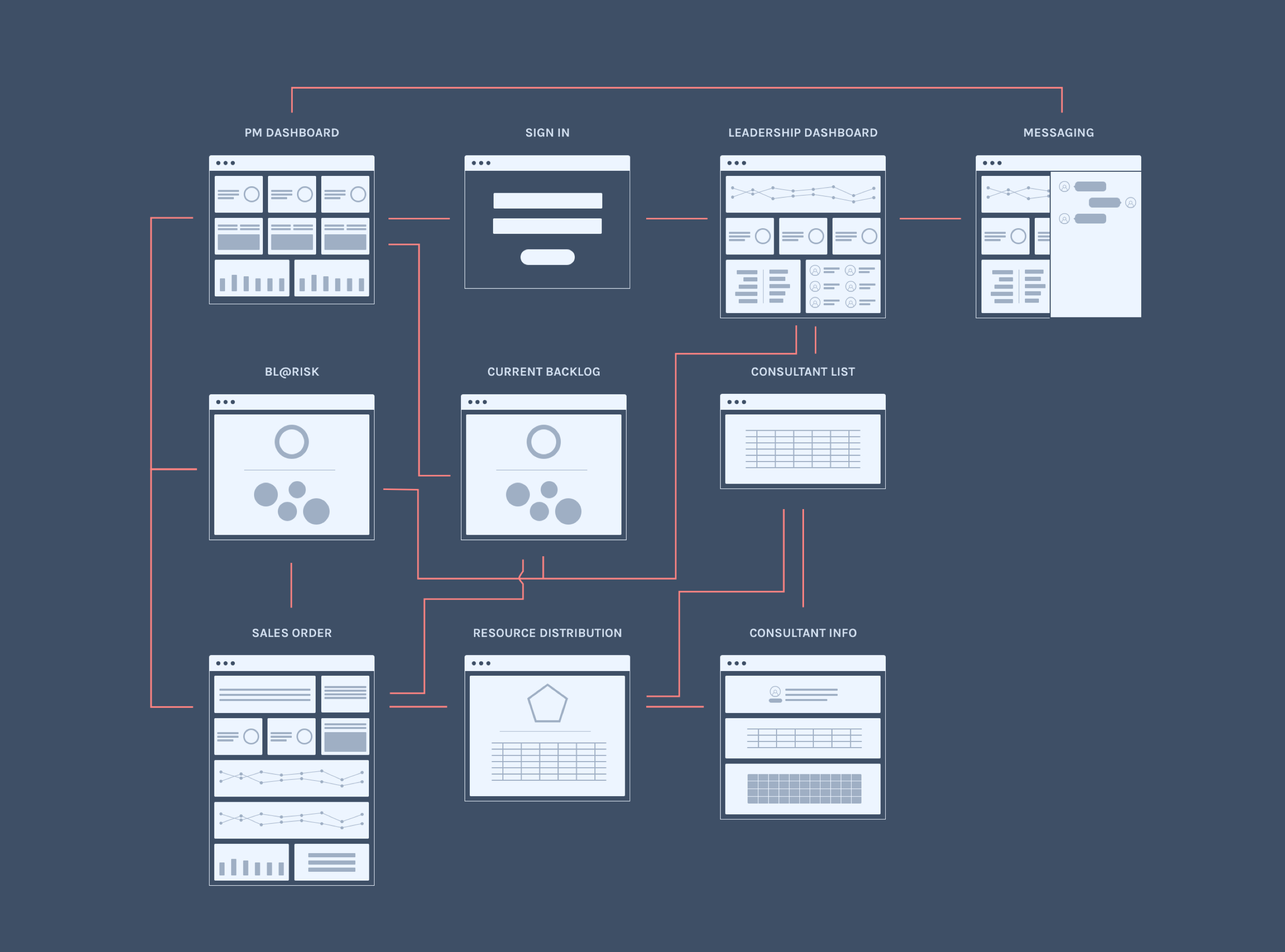
sitemap

Design process

Interview

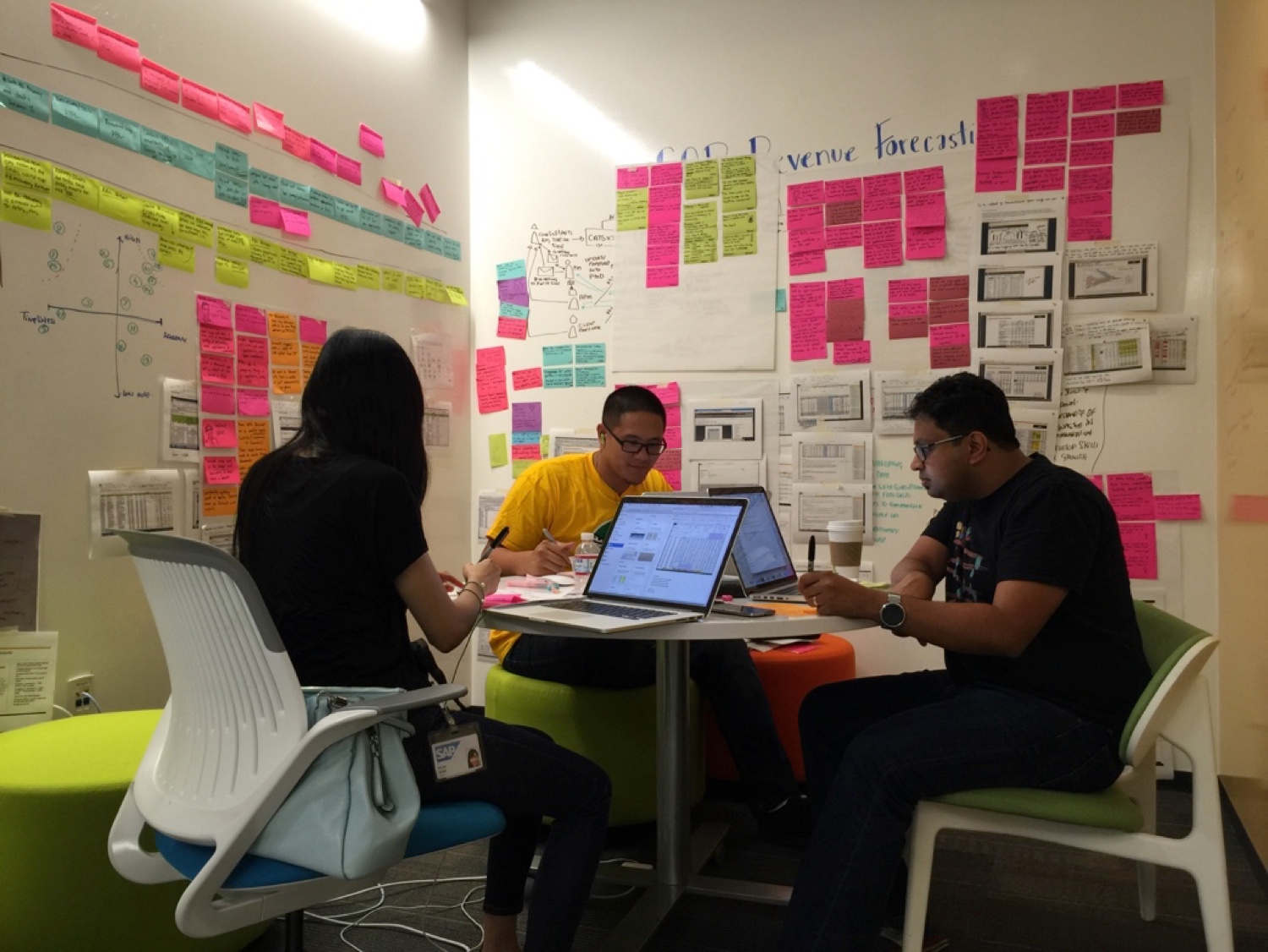
As none of us was familiar with revenue forecasting, the team started with learning Revenue Forecasting 101 from our own project manager. Once we grasped the basic terms and rationale, we started to interview the end users. We found it super helpful to send out pre-interview workbooks to our interviewees beforehand to orient the interview. After each interview, the team would synthesize the major findings and put them onto the affinity wall.

Flow model

Once we had enough data, we drew a flow model to understand the people and the systems involved and to identify the merging and breaking points. This helped us to gain a better understanding of the entire process.

Personas and experience journey mapping

We talked to 21 end users with 18 distinct titles. To make sure we are on the same page in terms of who we are designing for, we made 2 personas. I really liked that we were grouping the users by their responsibilities rather than the job titles. It also helped to document not only the interviewees’ business goals but also the personal goals like “practicing my people skills” to build empathy on a personal level. We also did experience journey mapping to sort out the common steps people take in the process as well as their touch points and emotions.

How might we

We came up with HMW’s to address the pain points and group them into a 2*2 chart to prioritize the HMW’s that both have the biggest impact on the business and are likely to be solved with technology.

Ideation and storyboarding

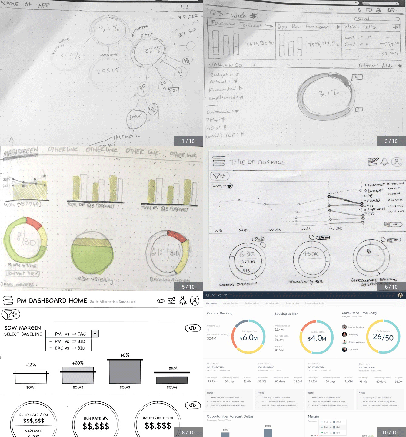
We started the design with 2 rounds of brainstorming, in which every one came up with ideas to address each HMW’s, and consolidated the ideas into a storyboard, which we used to confirm our direction with the end users.

the team drawing sketches
The design team drawing sketches

Wireframing, validation, and iteration

We presented the low-fi and mid-fi wireframes to the end users. For each user, we walked through the design catered to their data needs. We also presented the major alternative design direction. We asked the end users about the data points presented and their general impression. After each feedback session, we incorporated the changes.

iterations
Sketches, mid-fi and hi-fi of the homepage

Team

Jerry John, Jonathan Judal, David Ramsay (PM), Tony Ress (client side PM). We went through the research and ideation together. Then I developed the ideas for the project manager's dashboard and delivered the hi-fi mocks and mid-fi feature specs.